Colour plays a crucial role in design as it can greatly influence the overall perception, communication, and emotional response to a design. Visual appeal is one of the first most things that people notice when they see a product or any space. Colour has the power to instantly grab attention, balance composition or to create a highlight or contrast to any specific element in the room. There are multiple combinations to play with. However, there’s nothing like these 6 timeless combinations that melts our heart & excites the soul. Let’s have a look at what we love below!

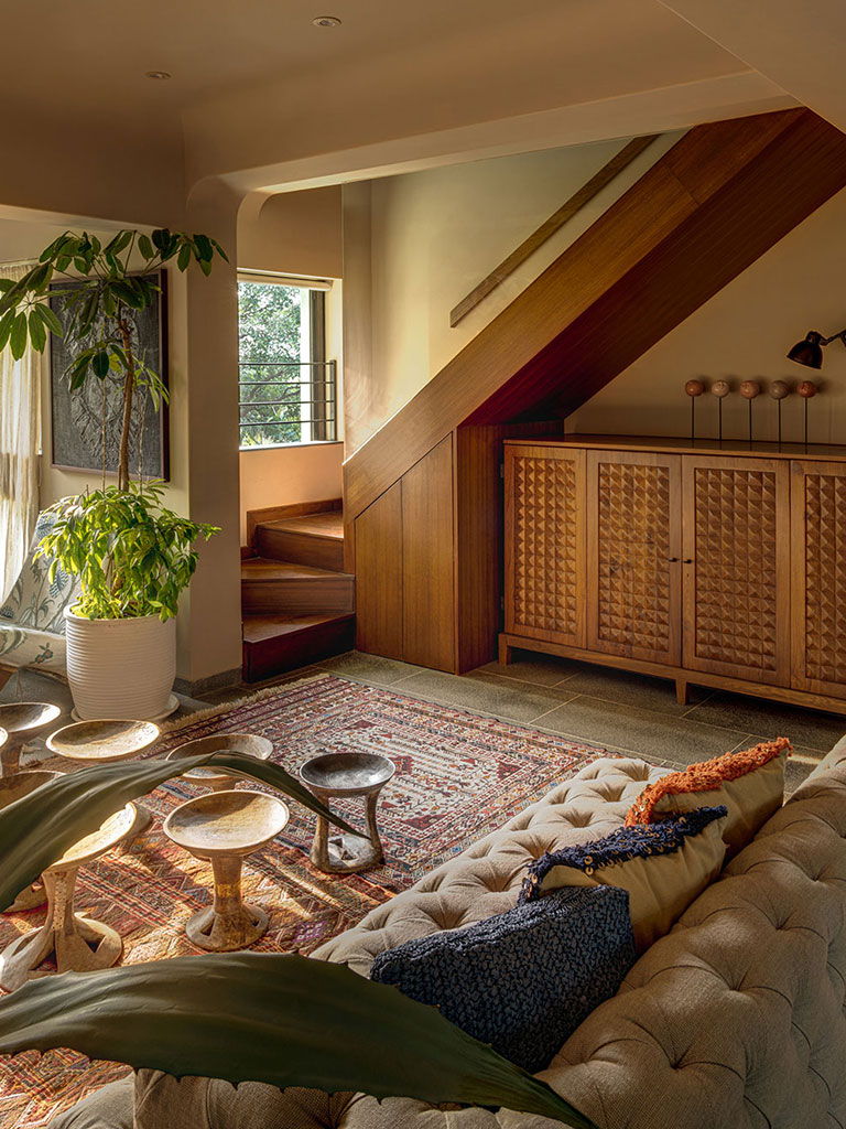
Beige and Brown: One of the most classic combinations ever created in time; this fusion creates warmth yet richness. Brown signifies strength, luxury and depth. While beige or cream shows comfort, softness and ageless beauty. It’s a much loved pair that has been loved by many and is continued to be loved still. Beige is a perfect shade to be used in the background such as walls, neutral furniture’s or flooring. While shades of brown in terms of wood works wonders for panelling or furniture pieces that stand out (such as a staircase!). It’s very hard to go wrong with this gorgeous pairing and yet sets a very easy playground to play in!

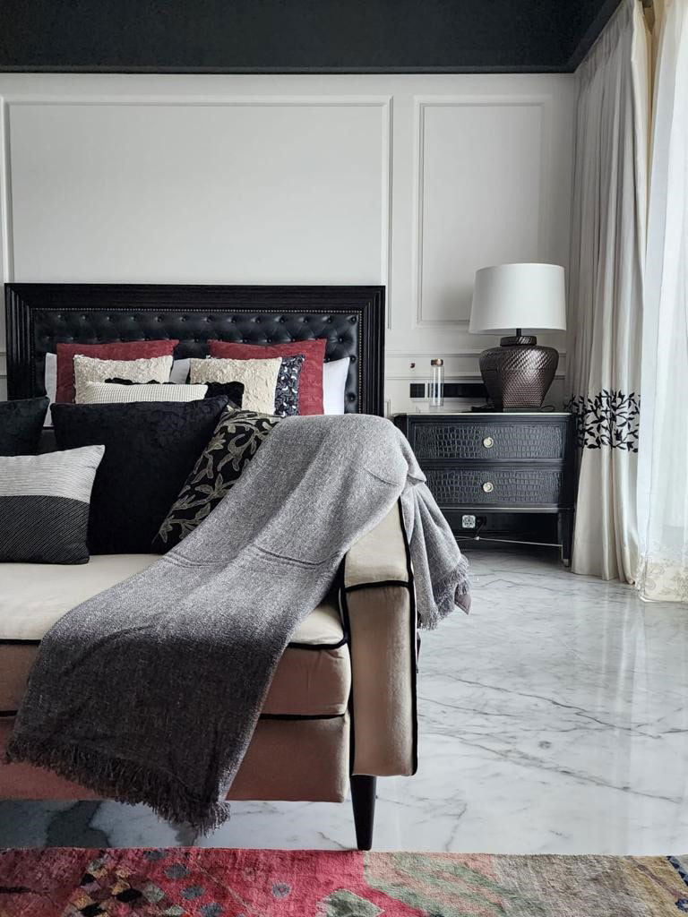
Black and White: This is one combination that never goes out of style. It exudes elegance and sophistication while providing a clean and crisp look. The stark contrast between these two colours creates a striking visual impact and a sense of balance. Black adds depth and drama while white signifies purity and clarity. It conveys a sense of cleanlinessand openness. This combination is very versatile and works wonders in all kinds of spaces while designing a home. Here we’ve used a minimally designed wall panelling in white with stunning black furniture placed upon a white marbled flooring.

Shades of Blue: Using combinations of a single colour is an ageless concept that has worked wonders for multiple spaces. From deep navy to bright pastels, the range of blues provide endless possibilities in creating a captivating colour palette. Pair it with other elements in your room and watch it merge as one. Here we’ve used a bright shade of blue for all the walls and ceiling making it one striking feature of the house. The printed blue flooring tile with an additional pop of colour ties down the flair of the space. It’s an exciting and an enriching colour to work with!

Red and Grey: The combination of red and grey creates a striking and bold aesthetic that balances warmth and sophistication. Red is often associated with energy and vibrancy. It can be used to create a focal point or as an accent colour. Grey on the other hand is a more subdued colour that symbolizes stability and elegance. It can serve as a neutral background that complements the red, allowing the vibrant colour to stand out. Shades of grey sets the tone of moods around the space. This combination can be fun and sexy, wild and elegant and so much more creating a perfect balance. Here we’ve used a grey shade for walls & flooring while the deep red bar stand outs paired with the wooden red painted ceiling rafters.

Pink/Magenta and Green: Using 2 lively colours is surely one way to tingle your senses of a visual appeal. This is one combination that is fresh and extremely harmonious in nature. It draws inspiration from nature. Shades of pinks or magenta is a feminine colour that represents love and tenderness. Lighter shades of pink can create a gentle and soothing ambiance, while bolder shades can bring energy and vibrancy to a space. Green on the other hand is associated with nature, growth and renewal. This colour can be incorporated in an impressive way like making the entry door stand out combining with the adjacent window frame. The deep pink surrounds the colour making it an exciting match to play with and works beautifully well when paired with each other.


Leave a Reply